Practical checksheet
Keep text enlargement and reflow in separate test rows
A repeatable checksheet for page zoom, narrow layouts, and isolated text experiments, with blank evidence fields and a fictional finding.
A text box can fit neatly while a nearby action disappears at a larger reading size. Review the complete page, keep each enlargement mechanism visible in your notes, and repeat the actions a reader needs. The text resize and reflow checksheet provides blank rows you can reuse for that work.
Name the page, state, and action
Choose one page and write down what the reader must accomplish. For a practice note editor, that might be reading an instruction, opening its help panel, entering sample text, and finding the save control. Use harmless sample content. A page name alone is too broad: the help panel's open state may need a separate row from the editor's initial state.
Record the URL or local page identifier, revision, browser and version, operating system, date, and display settings. Keep the initial zoom setting and viewport dimensions with the record. If you cannot determine a value, write unknown. Leave the observation fields untested until you have performed the stated action.
Run the text enlargement check
WCAG's Resize Text criterion addresses enlarging text up to 200% without losing content or function, with exceptions for captions and images of text. Use a supported browser enlargement mechanism and name it. With full-page zoom, begin at 100%, work through the available intermediate settings, and reach 200%. At each step, read labels and instructions and repeat the chosen action.
Look for missing words, overlaps, clipped messages, and controls whose labels become unreadable. Record the first setting where a problem appears. When a browser offers text-only enlargement, it can provide a useful additional comparison; record that as a different mechanism. Do not call doubling one CSS font-size value a completed review of the whole page.
Sources: W3C WAI: Understanding Resize Text
Give reflow its own run
For ordinary vertically scrolling content, WCAG's Reflow criterion uses a width equivalent to 320 CSS pixels and addresses preserving information and function without needing to scroll in two directions. A 1280 CSS-pixel starting viewport at 400% page zoom is the standard's example of that width. Certain content requiring a two-dimensional arrangement, such as a map, has an exception; surrounding prose does not inherit it.
Reset the page first, then perform and label the reflow run. Record the effective viewport width and how you obtained it. A developer-tool viewport set directly to 320 CSS pixels can examine a narrow layout, but that action has not itself enlarged the text. Keep it distinct from the 400% page-zoom run. On devices with pinch zoom, record that separately too: it changes the visual viewport without necessarily changing the layout viewport.
Sources: W3C WAI: Understanding Reflow, MDN: Viewport concepts
Copy this small observation matrix
Give every row the same evidence fields: run ID; mechanism and value; viewport width in CSS pixels; page state; exact action; visible result; outcome; evidence filename. Use observed okay, issue found, or untested for the outcome. The first label means only that the chosen action worked under the recorded conditions.
Row A — baseline: 100% page zoom, initial page, read the full instruction and perform the sample action. Row B — enlargement: each offered step through 200%, same states and actions. Keep one row per setting if the behavior changes.
Row C — reflow with zoom: 400% page zoom from a recorded 1280 CSS-pixel starting viewport. Row D — narrow viewport: 320 CSS pixels at 100% zoom, explicitly labeled as a separate layout check. Row E — revealed content: repeat the relevant runs with help, navigation, or validation messages open.
Add one observation per issue rather than squeezing several failures into a single sentence. Record whether the full instruction remained available and whether the intended control was operable. A screenshot can show an overlap, while the action notes establish what that overlap prevented.
Use the lab to investigate a smaller question
After finding a long-label problem, isolate a sample in the Text Layout Lab. Keep the sentence and wrapping mode fixed while changing the box width; then restore the width before changing text size. The lab reports its measured box and overflow conditions. Its controls change a sample inside the page, rather than applying browser zoom to the complete interface.
Download the lab observation if it helps explain the failure, and keep that file beside the full-page record. Add browser details manually where needed. Treat the reduced example as a clue: the real component's parent layout, surrounding controls, and open states still need the original test.
Measured lab example: one long identifier
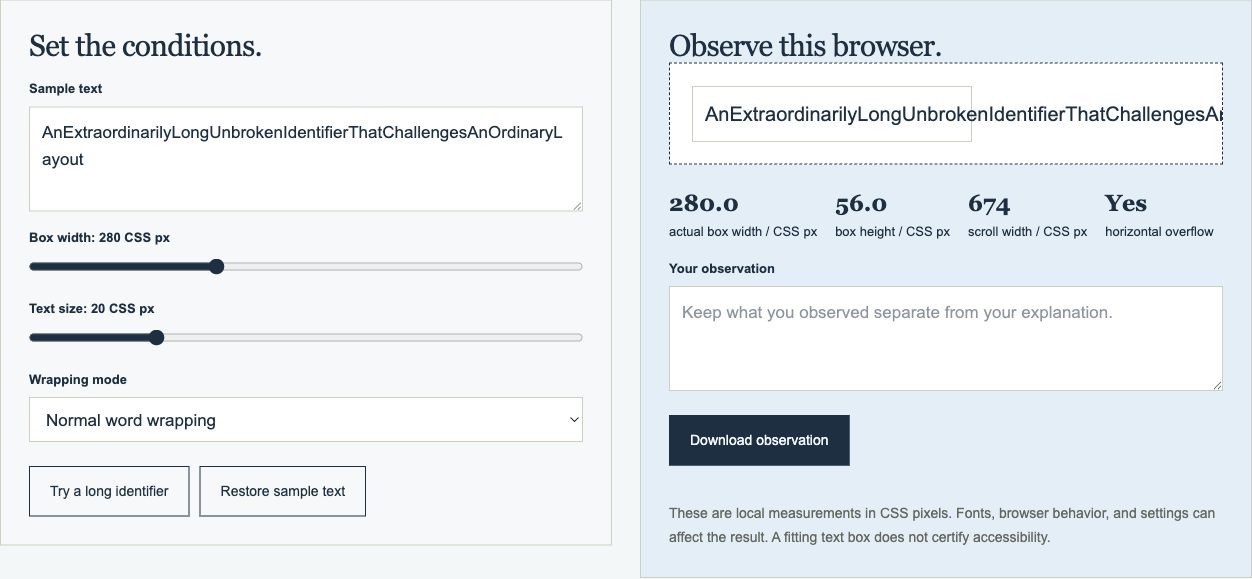
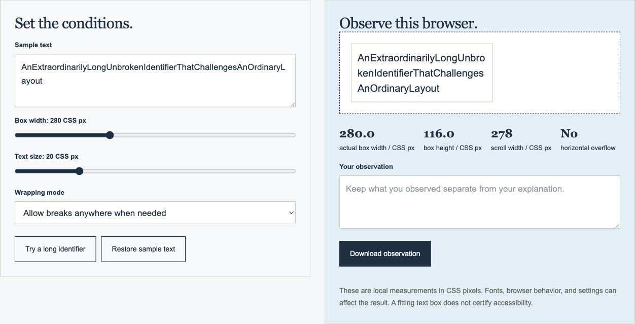
On September 7, 2026, a recorded Chrome session tested the lab’s built-in long identifier at a displayed box width of 280 CSS pixels and text size of 20 CSS pixels. The operating system was macOS 26.6.2, with a 1800 × 988 CSS-pixel page viewport. Chrome’s Reset Zoom shortcut was applied first; this run did not increase browser zoom. The full observation record includes the environment, exact text, timestamps and repeatable steps.
Only the wrapping control changed between the three observations. The tool’s border-box width remained 280 pixels and its client width remained 278 pixels. Normal wrapping and no-wrap both produced a scroll width of 674 pixels, exceeding that client width. Allowing breaks anywhere reduced scroll width to 278 pixels and increased box height from 56 to 116 pixels.
The result demonstrates a tradeoff in this particular sample: allowing a long identifier to break used more vertical space while removing its measured horizontal overflow. It does not show that all surrounding controls remained usable at increased zoom. Repeat the full-page and revealed-state checks described above for that separate question.
| Wrapping mode | Box height / CSS px | Client width / CSS px | Scroll width / CSS px | Horizontal overflow |
|---|---|---|---|---|
| Normal | 56 | 278 | 674 | Yes |
| Allow breaks anywhere | 116 | 278 | 278 | No |
| Do not wrap | 56 | 278 | 674 | Yes |
Sources: MDN: overflow-wrap
Keep a fictional finding narrow
Training example only: imagine that an editor's instruction is readable at baseline, but its second line sits behind a fixed save bar at 200% page zoom. A useful finding says, “In the help-open state at 200% full-page zoom, the final instruction line is covered by the save bar; scrolling does not reveal it.” It identifies a condition and consequence without claiming that every layout is broken.
The proposed change might allow the bar to take space in the page's normal layout. That remains a proposal until someone repeats the failing run. Preserve the original note, record the changed revision, and add the new result. Also repeat the baseline and relevant narrow-layout rows so the fix does not quietly move the problem elsewhere.
Leave a record another person can repeat
Finish with the tested states, remaining unknowns, evidence files, and next required check. Keep an unresolved issue visible even if other rows worked. The companion guide, Record a browser observation you can repeat, explains how to preserve inputs and distinguish measurements from explanations. Together, the notes should tell the next reader exactly what to try and what remains untested.