Viewport field note
What changes between an 800 and 801 CSS-pixel viewport?
A three-run browser observation of the exact viewport boundary where this publication's homepage changes from one hero column to two.
A responsive breakpoint is a boundary, not a gradual suggestion. This field note asks one narrow question: what changed on the Bright Field Notes homepage when a local Chrome viewport moved from 800 to 801 CSS pixels? A 799-pixel run checks the narrow-side result rather than relying on one observation alone.
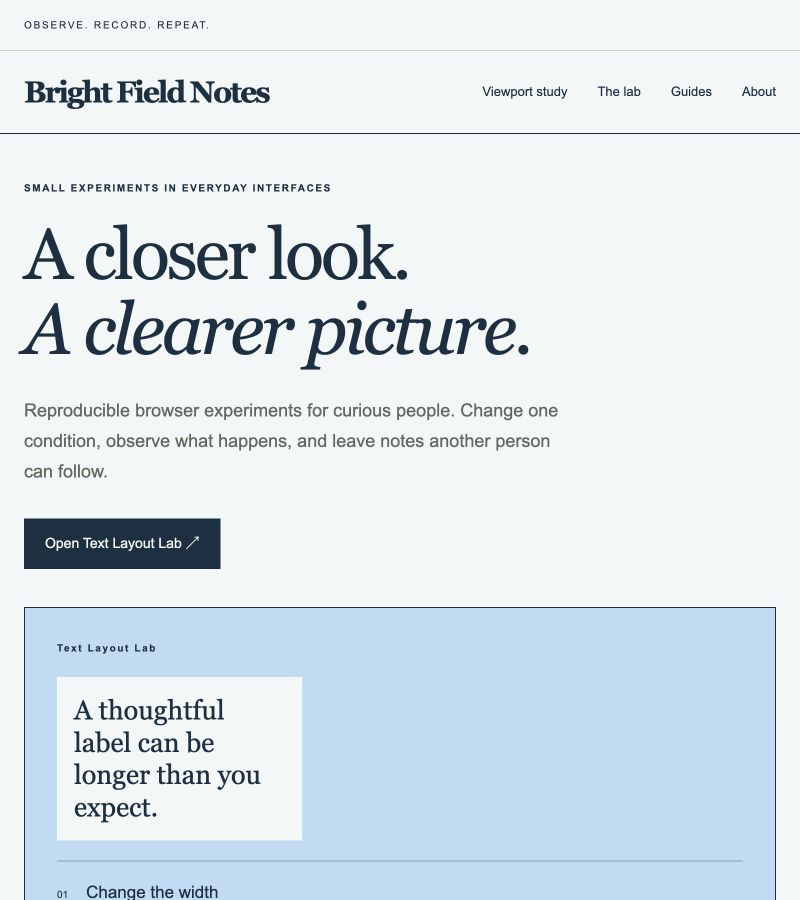
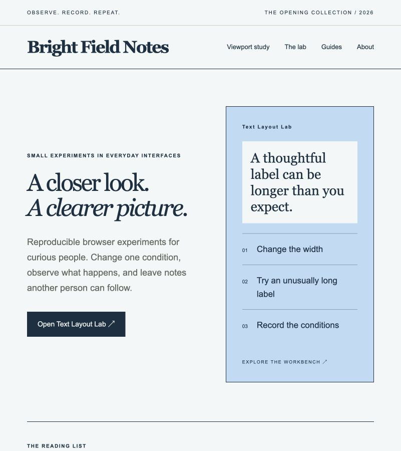
The recorded page switched from a single hero column at 800 pixels to two columns at 801 pixels. In the same step, page side padding changed from 24 to 54 pixels and the headline's computed font size changed from 72 to 48 pixels. The page had no document-level horizontal overflow in any of the three runs.
Ask one boundary question
The page stylesheet uses a maximum-width condition at 800 CSS pixels. Instead of sampling unrelated device presets, this run observed the page immediately below the boundary, at the boundary, and immediately above it: 799, 800, and 801 CSS pixels. Viewport height stayed at 900 CSS pixels.
Each run loaded the same local homepage revision. After applying a viewport width, the observer waited briefly for layout to settle, then recorded the viewport and document widths, the media-query result, the hero grid columns and height, headline font size, side padding, child rectangles, and page-level horizontal overflow. Screenshots were captured at 800 and 801 pixels.
Compare the recorded layout values
The 799- and 800-pixel results stayed on the same side of the breakpoint. Both matched the maximum-width condition, used one hero column, applied 24-pixel page padding, and rendered the headline at 72 pixels. The hero was about 1,042.51 pixels tall at both widths.
At 801 pixels the media condition no longer matched. The hero became two columns measuring about 331.77 and 296.23 pixels with a 65-pixel gap. Side padding increased to 54 pixels, the headline font size became 48 pixels, and hero height fell to about 702.77 pixels. That is a measured height difference of about 339.73 pixels from the 800-pixel run.
The document client width and scroll width were equal in every run, so this observation found no page-level horizontal overflow. That result is scoped to the captured initial homepage state; it does not say that every component or later interaction fits at these widths.
| Viewport | max-width: 800px | Hero columns | Hero height | Headline size | Side padding | Page overflow |
|---|---|---|---|---|---|---|
| 799 | Matches | 751 | 1042.51 | 72 | 24 | No |
| 800 | Matches | 752 | 1042.51 | 72 | 24 | No |
| 801 | Does not match | 331.77 + 296.23 | 702.77 | 48 | 54 | No |
Sources: MDN: Element.getBoundingClientRect(), MDN: Element.scrollWidth
Inspect both sides of the threshold
At 800 pixels, the text and workbench preview occupy separate rows. The headline fills much of the available width, while the preview begins below the primary action. This is the final width in the run where the maximum-width condition matched.
At 801 pixels, the same content sits in two columns. The screenshot makes the discontinuity visible: one additional CSS pixel changes several declared layout values at once. It does not imply that either arrangement is universally better; it gives a reviewer an exact boundary to inspect.
Repeat the observation
Use the homepage revision named in the JSON record. Set the browser viewport to 799 by 900 CSS pixels, wait for layout to settle, and record the media-query match, viewport and document widths, hero grid columns and height, headline font size, side padding, and document overflow. Repeat at 800 by 900 and 801 by 900 without changing the content or browser zoom.
Compare the 799- and 800-pixel results first. They should establish the boundary-side baseline. Then compare 800 with 801 to isolate the threshold crossing. Preserve different results instead of replacing this record; a changed stylesheet, font environment, scrollbar, browser, or zoom setting may explain them.
The raw JSON record keeps detailed layout measurements and source hashes. The CSV table provides a smaller comparison dataset.
Keep the limits attached
This is one Chrome session against a local preview. The exact Chrome version, operating system, device pixel ratio, and zoom value were not independently recorded. The run did not test Safari, Firefox, touch input, browser zoom, text-only zoom, translated text, reduced motion, or assistive technology.
The screenshots show the initial viewport only and crop content below 900 pixels. The measurements cover the homepage elements named in the record, not every route or interactive state. Equality between document client width and scroll width is evidence about document-level horizontal overflow in those runs, not an accessibility certification.
Version and correction history
Version 1.0.0 — September 16, 2026. Initial record with three viewport runs, two screenshots, JSON and CSV data, methodology, source hashes, and limitations.
Version 1.0.1 — September 16, 2026. Added an explicit CC0 1.0 reuse license for the original JSON and CSV evidence data. Measurements and conclusions are unchanged.